Transforming BryteSight: A Brand Refresh
Overview
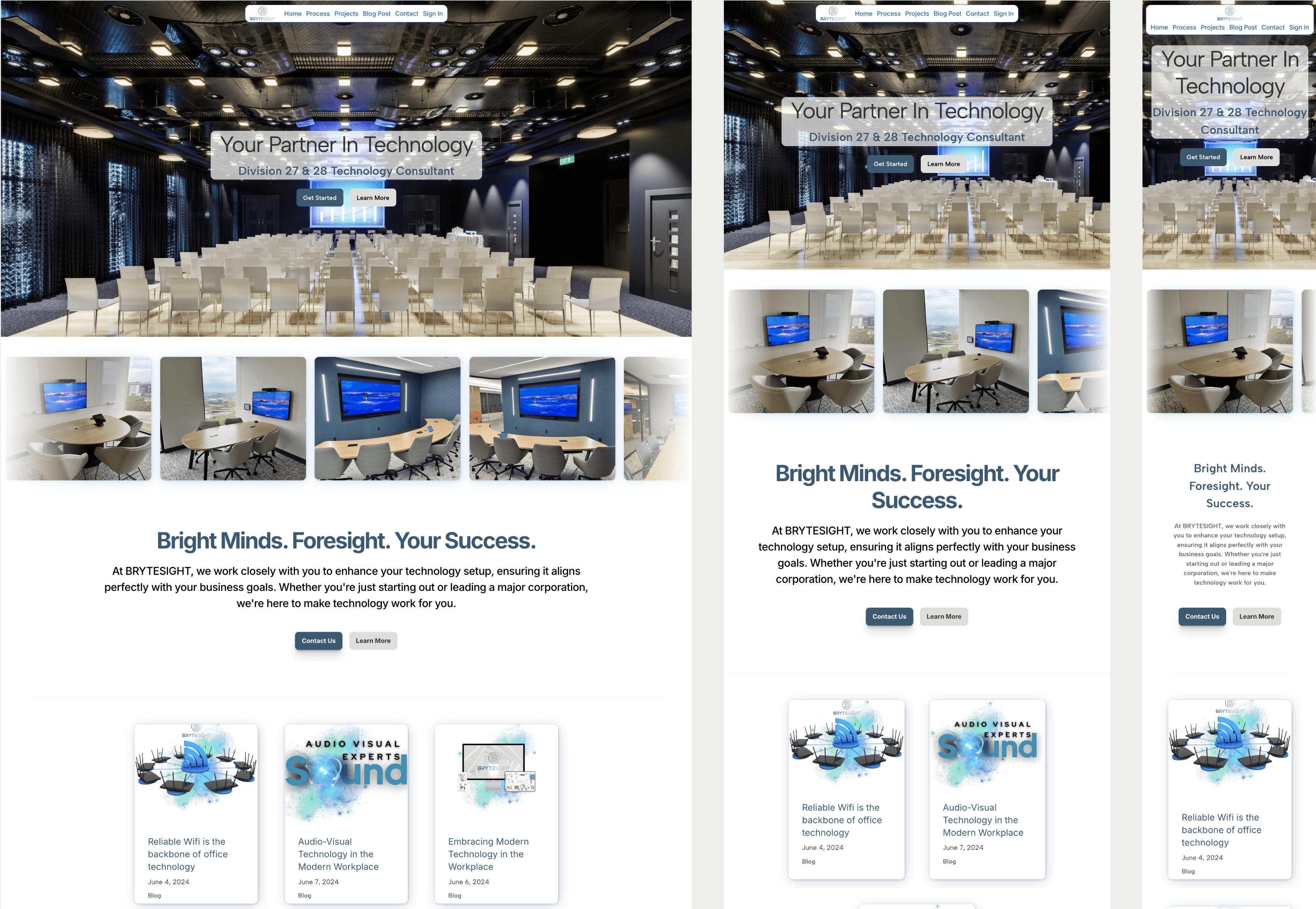
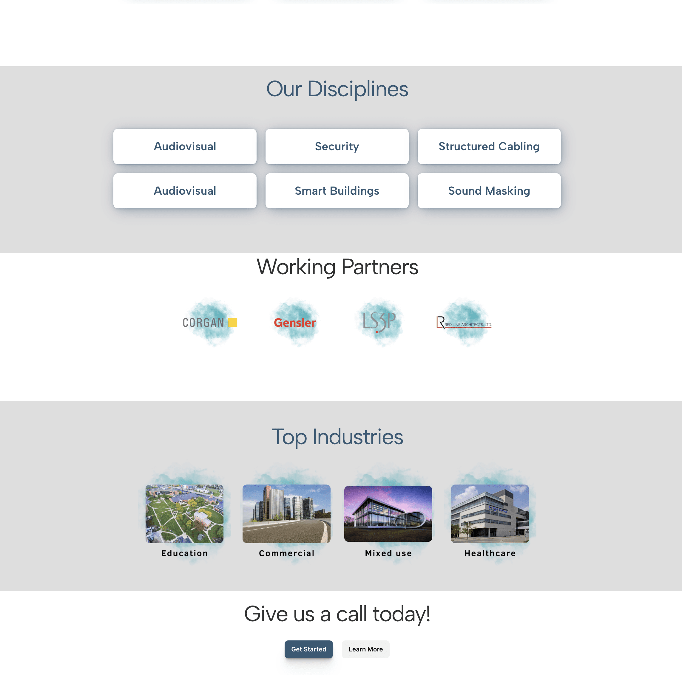
BryteSight approached us with a website that was functional but lacked the creativity and clarity necessary to engage their target audience effectively. The original site, designed by an admin assistant, was overly verbose, filled with industry jargon, and felt like a template rather than a unique reflection of their brand.
Our Approach
Recognizing the potential for improvement, we took a comprehensive approach to overhaul BryteSight's online presence. Here’s how we made a difference:
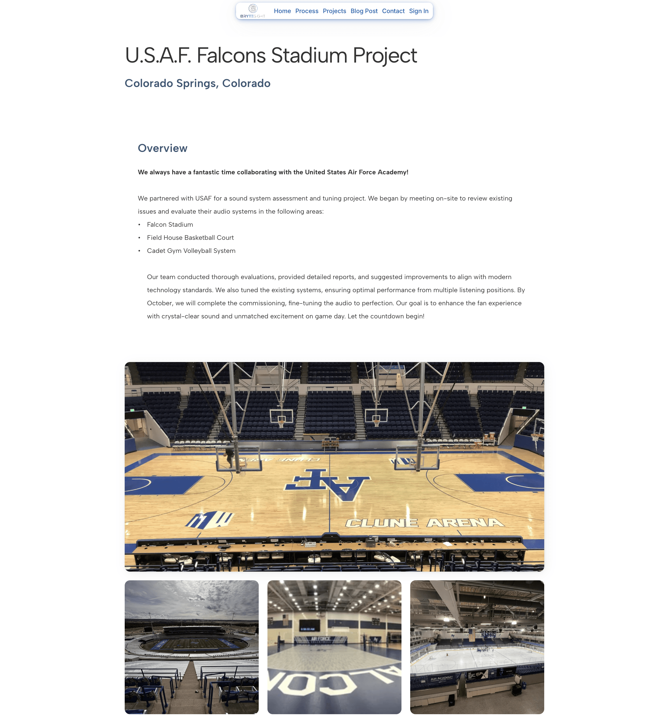
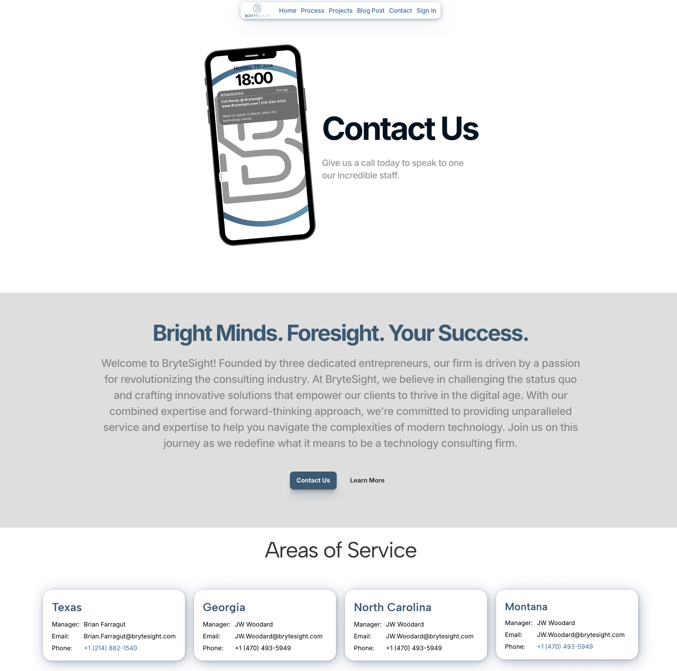
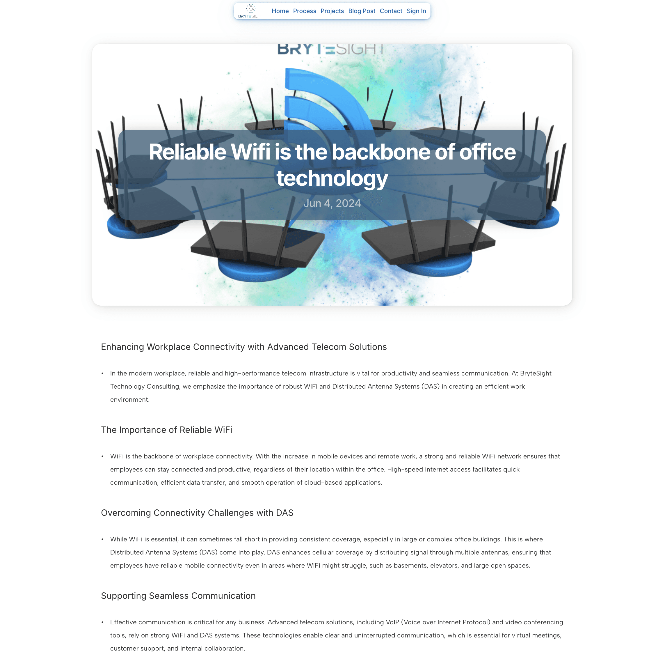
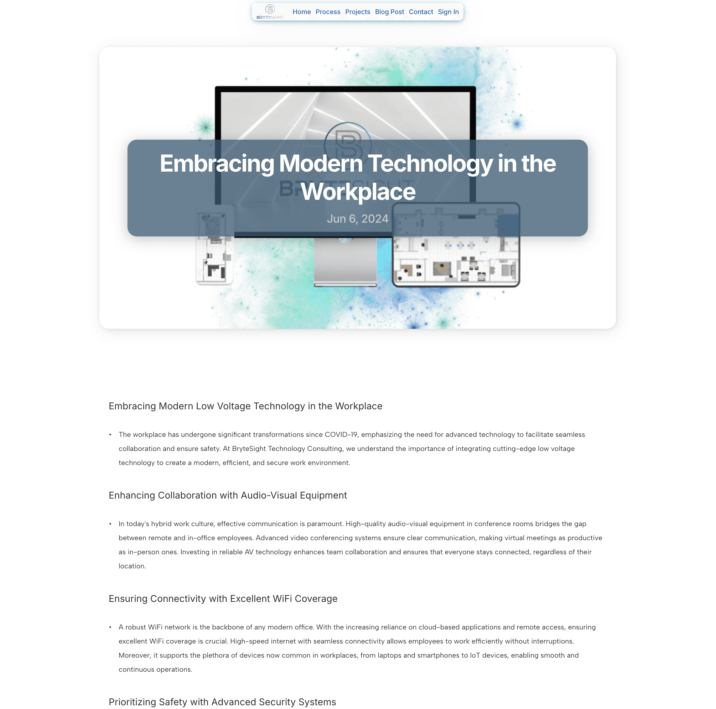
Content Writing: I meticulously crafted the website content to ensure it was not only informative but also engaging. By simplifying complex industry terms, we made the information accessible to a broader audience.
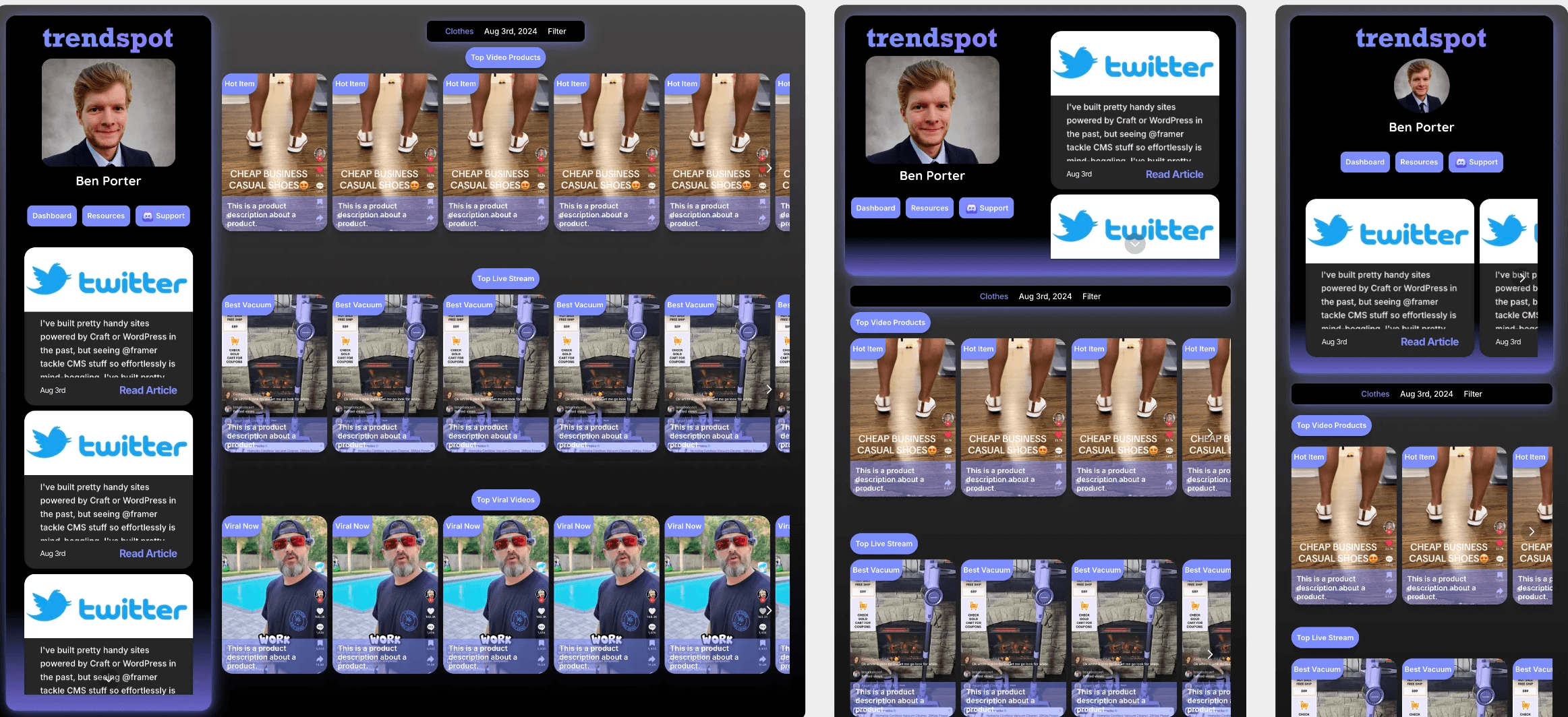
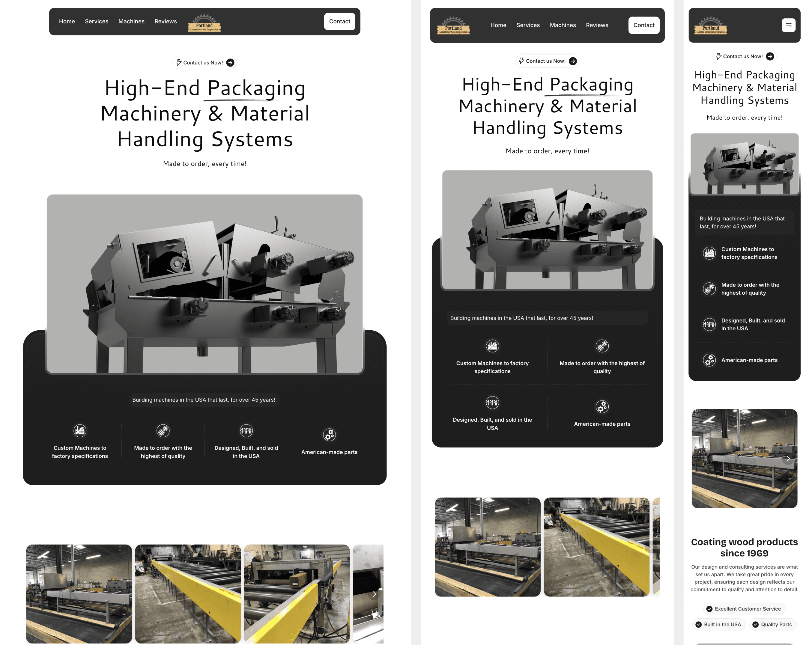
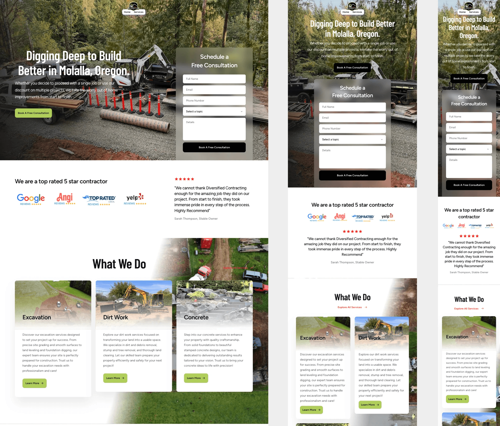
UX and UI Design: We redesigned the user experience and user interface, focusing on intuitive navigation and a clean, modern aesthetic. This shift helped create a more inviting atmosphere that resonates with visitors.
Target Audience Analysis: A key part of our strategy involved drilling down into BryteSight's target audience. We identified their needs and preferences, allowing us to tailor the messaging and design to better capture their attention and interest.
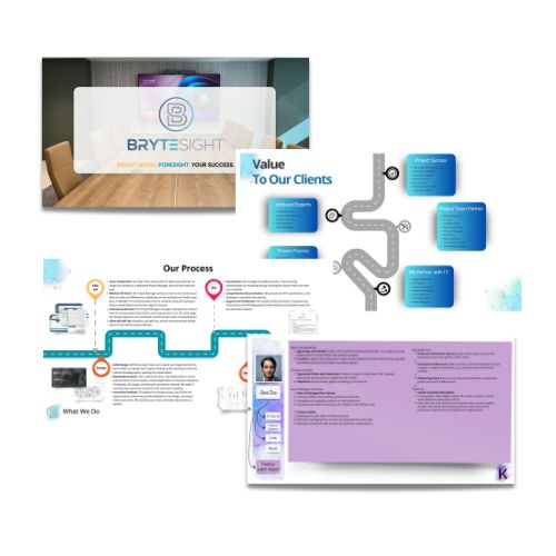
Pitch Deck Redesign: To complement the website overhaul, I also redesigned their pitch deck. By simplifying the information and focusing on key messages, we aimed to enhance their outreach and improve their chances of securing new clients.
The Result
The revamped BryteSight website now showcases their services in a fresh, engaging manner, making a strong first impression on potential clients. The simplified pitch deck is more impactful, helping the team communicate effectively with stakeholders and prospects
